
-- and colour! Give me paper, some kind of marker, and some kind of colour, and I'm happy. A pretty stone paperweight (taking a bow in the upper right corner), and scissors are nice extras -- and lately in my art class, I've enjoyed playing with all of the above. Are you ready to whisk through three weeks of homework with me?
Here's a nifty exercise in "reduction" -- getting down to how much of an object's detail is needed for someone else to recognize it. Here we go, in a series of 2-inch squares. First one: A simple drawing of a recognizable object.

Second: Reduce the object by cropping so that it can still be identified.

Third: Crop further so that an innocent bystander wouldn't have a clue what it was.

Fourth: Reverse the tones -- what was white becomes black, what was black becomes white.

Then, add another two squares -- one using black, white and one colour; the second using black, white and several colours -- and put all of them together into an engaging composition.

Okay. I did the project but I'm not wildly satisfied with the outcome -- despite hours and hours spent wracking my brain on what to choose and how to put it all together.
The next week's homework had nothing ambiguous about it, just a lot of hard labour doing something that looks deceptively easy:-- making a 9-step tonal scale from white to black. Last semester, we did this in dry media which was tough enough.
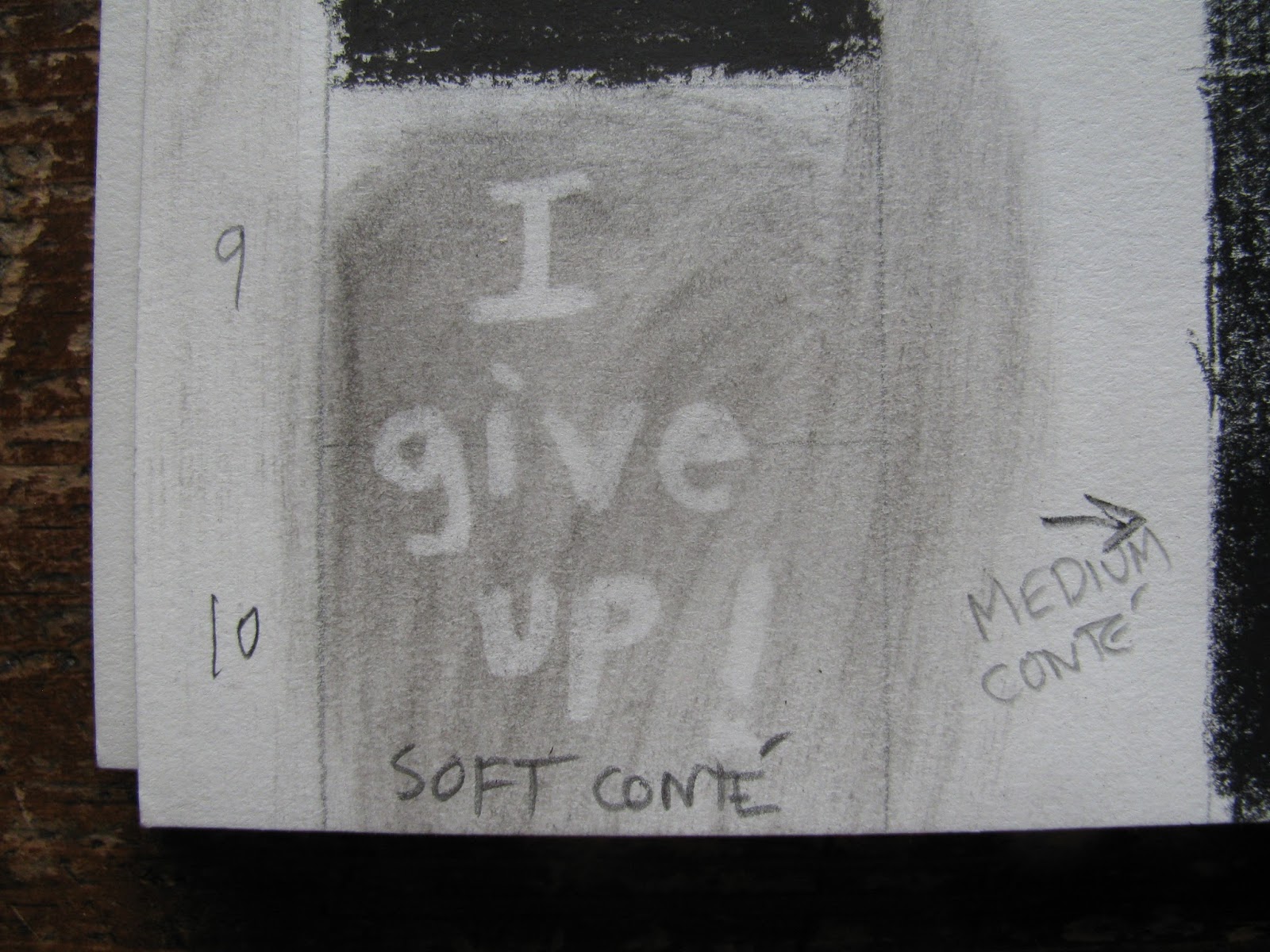
It's even harder in paint. But here's the outcome in all its glory:-- the 9-step grey scale, with colour chips matched in tone to the greys. On the right, an exercise in seeing how the same tone of grey (the small square at the centre) appears to be a different tone on each of several different backgrounds. (Some of these subtleties cannot be captured by the camera)

We're into colour now! Hurray! Our first experiment was reproducing some of Chevreul's theories on colour perception. We each made a simple design using two colour complements (opposites on the colour wheel).

Then we viewed our own for a minute or so as it hung on the white classroom wall, and then we turned our gaze to the wall itself. Voilá ! Against the white, the colours reversed -- my prominent red-orange leaves showed as blue.
With these colour exercises under our belt, we created a tonal series based on our own simple design. The first: Shades of grey. The second -- exactly the same object, in shades of one colour (tube colour + different amounts of white or black). The third -- same object in analogous colours ("neighbours" on the colour wheel). The objective was to match all the tones, from one panel to the next -- so that if you blur your eyes, the lightest shape in the centre panel matches the lightest grey in the first panel, and so on.

Even before I started, I knew I'd be longing for coffee -- and that image kept me going, especially the third panel with its warm orange/brown tones.
As I write this, I'm preparing for my 8th and final class. You'll be seeing the coffee mugs again and some much more exciting stuff. But right now, this is the moment I've been waiting for to share a picture I saved from last summer:-- a perfect 9-step grey scale that neighbours down the block painted on their front porch steps. It's a little distorted by the bright early morning sunshine and the shadows from the porch railing -- but they absolutely nailed it.

No comments:
Post a Comment